
Phone layout
The phone layout is not a squeezed panel. Navigation moves to the thumb, rooms become a drill-down and the destinations you use most sit in the bar in an order you choose.
Bottom bar
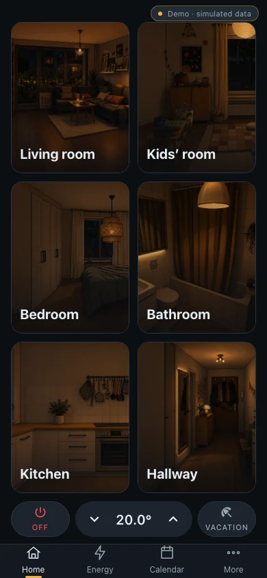
Section titled “Bottom bar”A floating pill with three destinations you pick plus More. Arrange it from the More menu: two groups, the bar and the rest, drag to reorder. The More menu shows every category. Media remembers whether you last opened room audio or the library.
Room cards with picture, name and light status, in one to three columns. In the evening a tile shows the unlit picture when no light is on in that room. Above the bar sits a row of quick actions: Everything off, the central climate pill and a third action that can be holiday mode or any device.
With many rooms the grid scrolls behind the quick actions. Swipe left on the grid to open a side sheet with rooms per row and a switch to hide the quick actions. Both are per device.
Room sheet
Section titled “Room sheet”A tap on a room opens a full-height sheet with the room’s scenes and devices. Swipe down on the header to close it. Browser Back also works.
Shopping list
Section titled “Shopping list”A quiet checklist: store names as small headings, every row tappable in full, an empty circle that fills when you tap it. The item moves to Done at the bottom. A strip above the bar offers Undo for five seconds. Each store ends in an Add item row.
Energy
Section titled “Energy”Opens with the power right now, then a period row (Today, Week, Month, Total) with the load curve of the day, a comparison with yesterday and a Top consumers list.
Reminders and calendar
Section titled “Reminders and calendar”Reminders and the shopping list are separate phone destinations even though the panel combines them in Notes. The calendar is the same sheet of paper as on the panel.
Notifications
Section titled “Notifications”Notifications flow with the content instead of covering it. A lost connection shows as a small floating chip.